
The Art of Designing Memorable Visiting Cards: Tips and Ideas
In a world bustling with digital interactions, the humble visiting card still holds a unique place in business and networking. It’s a tangible representation of your identity and a first impression that can leave a lasting impact. Designing a memorable visiting card involves more than just slapping your contact details onto a piece of paper; it’s an art that combines creativity, psychology, and functionality. In this comprehensive guide, we’ll explore tips and ideas for crafting visiting cards that stand out from the crowd.
Understanding the Purpose of Your Visiting Card:
Before delving into the design process, it’s crucial to understand the purpose of your visiting card. It serves as a quick reference for your contact information, but it’s also a representation of your brand, professionalism, and personality. Keep this in mind as you proceed to design.
Example: Imagine you’re a graphic designer known for your bold and innovative designs. Your visiting card could feature vibrant colours, unique typography, and an abstract design that reflects your creativity.
1. Reflect Your Brand Identity:
Your visiting card should reflect the essence of your brand. Consider the color scheme, typography, and overall design in relation to your company’s image. For instance, a law firm might opt for a more formal and traditional design, while a creative agency could lean towards a vibrant and contemporary look.
2. Keep it Clean and Simple:
Simplicity often leads to clarity. Avoid cluttering your visiting card with excessive information or design elements. Include essential details such as your name, designation, company name, phone number, email address, and website. Less is often more when it comes to effective design.
Example: If you’re a minimalist fashion designer, your visiting card might feature a single colour, a simple logo, your name, and a website link. This simplicity reflects your design philosophy.
3. Play with Typography:
Typography can play a significant role in making your visiting card memorable. Choose fonts that align with your brand’s personality. Combine a bold font for your name with a cleaner font for the rest of the information. Experiment with different font sizes to create a hierarchy and emphasize crucial details.
Example: A vintage bookstore owner might choose a cursive font to evoke nostalgia, while a tech-savvy consultant might opt for a sleek, sans-serif font for a contemporary feel.
4. Incorporate Your Logo:
Your company logo is a visual anchor for your brand. Integrate it into your visiting card design, placing it strategically to enhance recognition. This adds a professional touch and reinforces your brand’s identity.
Example: A nature photographer could use recycled paper with a slightly rough texture, symbolizing their commitment to environmental conservation.
5. Use High-Quality Materials:
The texture and material of your visiting card can leave a tactile impression. Opt for high-quality paper or alternative materials like metal, wood, or even eco-friendly options. The choice of material can enhance the overall feel and uniqueness of your card.
6. Experiment with Shapes and Sizes:
While the standard rectangular shape is common, playing with shapes and sizes can make your card stand out. Rounded corners, square cards, or even die-cut designs can add an element of intrigue. Just ensure that the chosen shape aligns with your brand’s identity.
7. Incorporate Visuals:
Visual elements such as icons, patterns, or images can add a touch of personality to your visiting card. Use visuals that resonate with your industry or expertise. However, maintain a balance to avoid overwhelming the design.
Example: An architect’s visiting card might feature a small blueprint sketch, while a baker’s card could include a charming illustration of a cupcake.
8. Choose a Striking Color Palette:
Colours evoke emotions and convey messages. Choose a colour palette that aligns with your brand and its values. Consider colour psychology – for example, blue denotes trust and professionalism, while red signifies energy and passion.
Example: A wellness coach might opt for calming pastel shades like light blue and soft green, while a tech startup founder might use a modern combination of black, white, and electric blue.
9. Embrace Minimalism:
Minimalist designs are not only aesthetically pleasing but also convey a sense of elegance and sophistication. Utilize negative space to create a clean and uncluttered look. Remember, the goal is to make your information easily accessible and visually appealing.
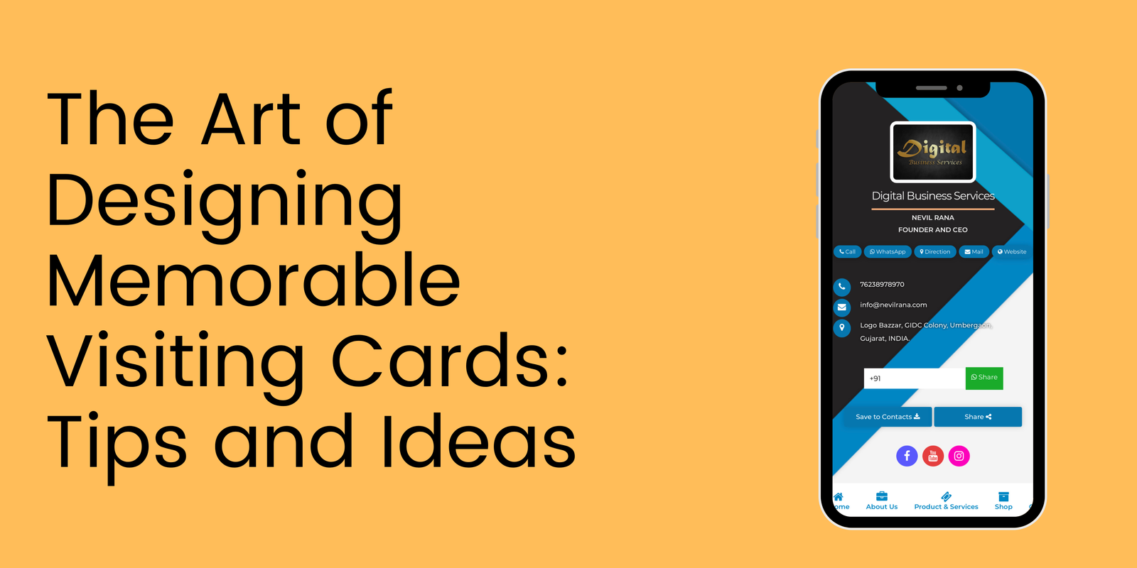
10. Consider Interactive Elements:
Incorporating interactive elements like QR codes can bridge the gap between traditional and digital. A QR code can lead recipients to your website, portfolio, or social media profiles, enhancing their engagement with your brand.
11. Double-Check Information:
Before finalizing your design, meticulously review all the information on your visiting card. Typos and incorrect details can undermine your professionalism. Ensure that your contact information is accurate and up to date.
12. Seek Professional Help:
If design isn’t your forte, consider hiring a professional graphic designer. Their expertise can translate your ideas into polished and visually appealing visiting cards.
In conclusion
The art of designing memorable visiting cards combines creativity, strategic thinking, and attention to detail. Your visiting card is a tangible representation of your brand, making that first impression count. By reflecting your brand identity, keeping the design clean and simple, using high-quality materials, experimenting with shapes and sizes, and incorporating visuals and colour psychology, you can create a visiting card that leaves a lasting impact in the minds of those who receive it. Remember, a well-designed visiting card is not just a piece of paper; it’s a conversation starter and a gateway to meaningful connections.
FAQ
1. Why is the design of a visiting card important?
The design of a visiting card is crucial because it’s often the first impression people have of your business or personal brand. A well-designed card can leave a lasting impact and make you memorable.
2. What are some key elements of a memorable visiting card?
Key elements include a clear and legible font, an appropriate colour scheme, relevant imagery or logo, and well-organized contact information.
3. How can I make my visiting card stand out?
You can make your card stand out by using unique shapes, incorporating textured or special materials, opting for a creative layout, or adding a touch of innovation like QR codes or augmented reality.
4. Should I include a photo on my visiting cards?
It depends on your industry and personal brand. A photo can add a personal touch, but make sure it’s high-quality and professional.
5. What’s the significance of colour choice in visiting card design?
Colours evoke emotions and perceptions. Choose colours that align with your brand identity and the message you want to convey. For example, blue might symbolize trust, while red could signify energy or passion.
6. How can I effectively use typography in my card’s design?
Choose fonts that are easy to read and align with your brand’s tone. Avoid using too many fonts; stick to a maximum of two to maintain visual consistency.
7. Should I follow a minimalistic design or go for a more detailed approach?
Both approaches can work, but it depends on your brand’s personality. Minimalistic designs can communicate professionalism, while detailed designs might convey creativity.
8. What’s the role of white space in visiting card design?
White space, or negative space, is crucial for clarity and visual balance. It prevents the card from appearing cluttered and allows the essential elements to stand out.
9. Can I design my own visiting card, or should I hire a professional?
If you have design skills, you can certainly create your own. However, a professional designer can bring expertise and creativity to ensure a polished result.
10. How can I ensure that my visiting card represents my brand accurately?
Your card should reflect your brand’s values, aesthetics, and industry. Use elements like logo, colour scheme, and typography that align with your overall brand identity.